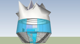
This is Ricky Swallow's studio space above ground.
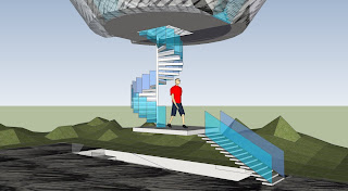
These are the stairs leading to the gallery space from Ricky Swallow's studio space. The balustrades are the same colour and style as the windows in Swallow's proposed studio space which I think links the space well to the gallery area.
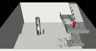
This is Richard Goodwin's studio space which is located below ground. The balustrades for the stairs are of a similar style to the ones in Ricky Swallow's space. The colour of the glass was deliberately chosen to compliment the colour of the green bottle glass used in Goodwin's artwork 'Waterjacket' which is located in the middle of the room.
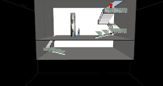
In this view the lower space for Goodwin can be seen. This area has a considerably lower ceiling than the main studio space, as my intention for this area was for storage of materials (as Goodwin works with a range of materials (such as cloth, metal and concrete) which would need a storage area. Goodwin could also use this area for welding.
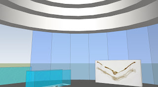
This is the studio space for Ricky Swallow. The glass windows surrounding the room makes it feel more spacious, and the ceiling gradually getting higher rather than being flat helps with this also. The stairs then lead down to another room which could be used for storage or more studio space, but there aren't as many windows in this area.
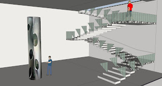
This area is the other studio space (for Richard Goodwin) and the stairs I designed are extra wide in order to make it easier to carry the artwork upstairs and the ceiling is 7 metres high so that the artwork fits well. The balustrades are quite low, and they are also not solid glass like the ones above as more space is needed to maneuver the artwork up the stairs.
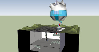
I added some landscaping to the outside areas of the gallery space to make it a more defined area on the ground level and added the material of grass to create more context for the model. I also made the underground level look more underground and dark as it would be by adding a large box to surround the below ground studio, and I think it works very well.


 These images are from slide 50/81 (from Lecture_07_TheBlackBox_2010.pdf) in the section called Shadow as a Refuge, which is Erika Kruger's Project 3 of The Black Box slide show.
 This is Ricky Swallow's studio space above ground.
 These are the stairs leading to the gallery space from Ricky Swallow's studio space. The balustrades are the same colour and style as the windows in Swallow's proposed studio space which I think links the space well to the gallery area.
 This is Richard Goodwin's studio space which is located below ground. The balustrades for the stairs are of a similar style to the ones in Ricky Swallow's space. The colour of the glass was deliberately chosen to compliment the colour of the green bottle glass used in Goodwin's artwork 'Waterjacket' which is located in the middle of the room.
 In this view the lower space for Goodwin can be seen. This area has a considerably lower ceiling than the main studio space, as my intention for this area was for storage of materials (as Goodwin works with a range of materials (such as cloth, metal and concrete) which would need a storage area. Goodwin could also use this area for welding.
 This is the studio space for Ricky Swallow. The glass windows surrounding the room makes it feel more spacious, and the ceiling gradually getting higher rather than being flat helps with this also. The stairs then lead down to another room which could be used for storage or more studio space, but there aren't as many windows in this area.
 This area is the other studio space (for Richard Goodwin) and the stairs I designed are extra wide in order to make it easier to carry the artwork upstairs and the ceiling is 7 metres high so that the artwork fits well. The balustrades are quite low, and they are also not solid glass like the ones above as more space is needed to maneuver the artwork up the stairs.
 I added some landscaping to the outside areas of the gallery space to make it a more defined area on the ground level and added the material of grass to create more context for the model. I also made the underground level look more underground and dark as it would be by adding a large box to surround the below ground studio, and I think it works very well.
 This image shows Richard Goodwin's studio space, containing his work "Waterjacket" which is about 5 metres tall. The stairs still need balastrades, but I added the "opaque" texture to them which is an angular design to reflect on the angular design of the stairs I designed for carrying "Waterjacket" up to the gallery space.
 This image shows the above ground area, containing Ricky Swallow's studio space with his work "Tusk". The windows around the outside of his studio space are blue glass to make the room bright and feel more open and bigger. I also used my texture on the outside of the lower area of the studio space that represents "fragment". The gallery area (which still needs work) has a "fibrous" texture which I chose in order to differentiate it from normal ground texture like concrete or even grass which will make the gallery space more obviously distinguished between other ground level areas.